
Accordion
Cards
Promotion cards

Promotion card: display style 'Thumbnail'
This is the summary. Give a brief, clear description of the link destination. (This card is displaying with thumbnail image selected.)

Promo card: display style 'Profile'
Instructions for adding promotion cards. (This card is displaying with profile-style image selected.)
Promo card: display style 'Highlight'
The highlight display style is a coloured gradient across the top.
Promo card: display style 'No image'
This is what a promotion card looks like when it has no image selected and the link is an absolute link (added via URL instead of a node link).
Navigation cards

Navigation card: display style 'Thumbnail'
This is the summary. Give a brief, clear description of the link destination.
Navigation card: display style 'Featured'
Navigation cards fill the full width of the content area. They will always stack vertically.
Navigation card: display style 'No image'
This nav card has display style ste to 'No image'
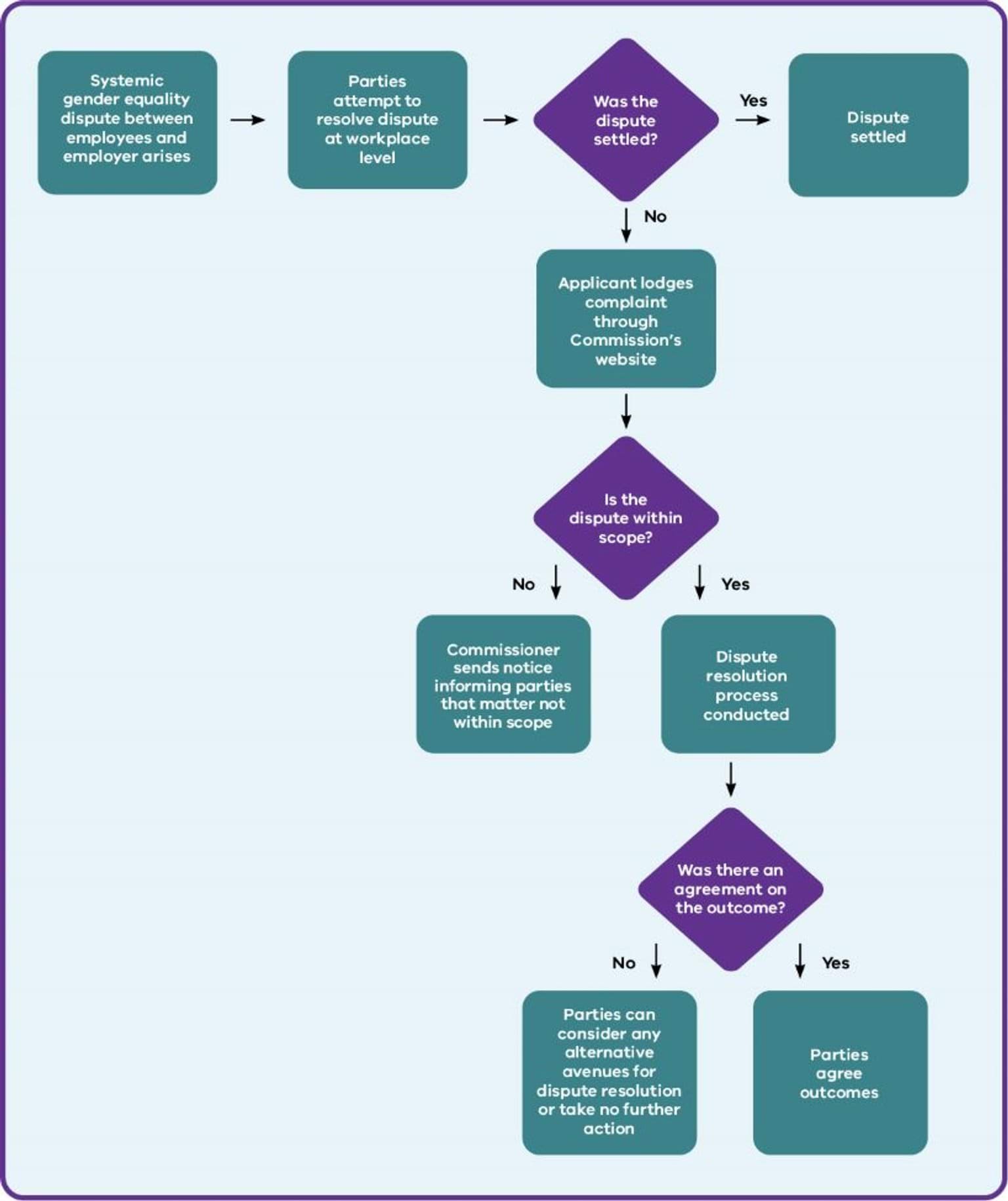
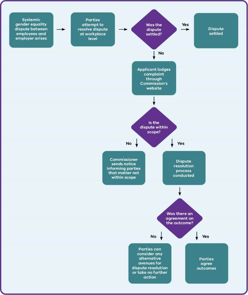
Key dates
Card sorting options
Card carousel
Content collection (new version in release 1.58)
Optional description.
This sample content collection displays footer pages. Content source is set to manual and pages have been manually added. The cards that display depend on what is selected and also what is tagged to this particular website. Display options is set to card and not to show images.
The CTA destination link may not display due to the page being tagged to a different site.
Accessibility
Accessibility information about this website. We endeavour to conform to level AA of the W3C Web Content Accessibility Guidelines 2.2.
Disclaimer
Legal disclaimer information for vic.gov.au websites
Copyright
Copyright information for this website.
Content collection - 1.58 basic example
This content collection is set up with Content source automatic and no filters applied in Refine content so it works on multiple sites. Displaying list view and 6 items. No CTA link.
- LGI acknowledges the public interest in its work and the impact that complaints and investigations may have on the mental health and wellbeing of those involved
Updated: 21 April 2026
- Information about website privacy - what information we collect and why.
Updated: 4 May 2026
- Accessibility information about this website. We endeavour to conform to level AA of the W3C Web Content Accessibility Guidelines 2.2.
Updated: 18 June 2026
- A councillor may be stood down while their behaviour as a councillor is under investigation or if they have been charged with a serious offence.
Updated: 31 July 2025
Compact card collection (Ripple = Category grid)

Health and social support
Compact cards can have an image or no image.

Traffic and transport
Ideally the images are simple transparent line art using the primary colour.
Sport and recreation
Compact cards have a transparent background and no outline though the whole card is clickable.
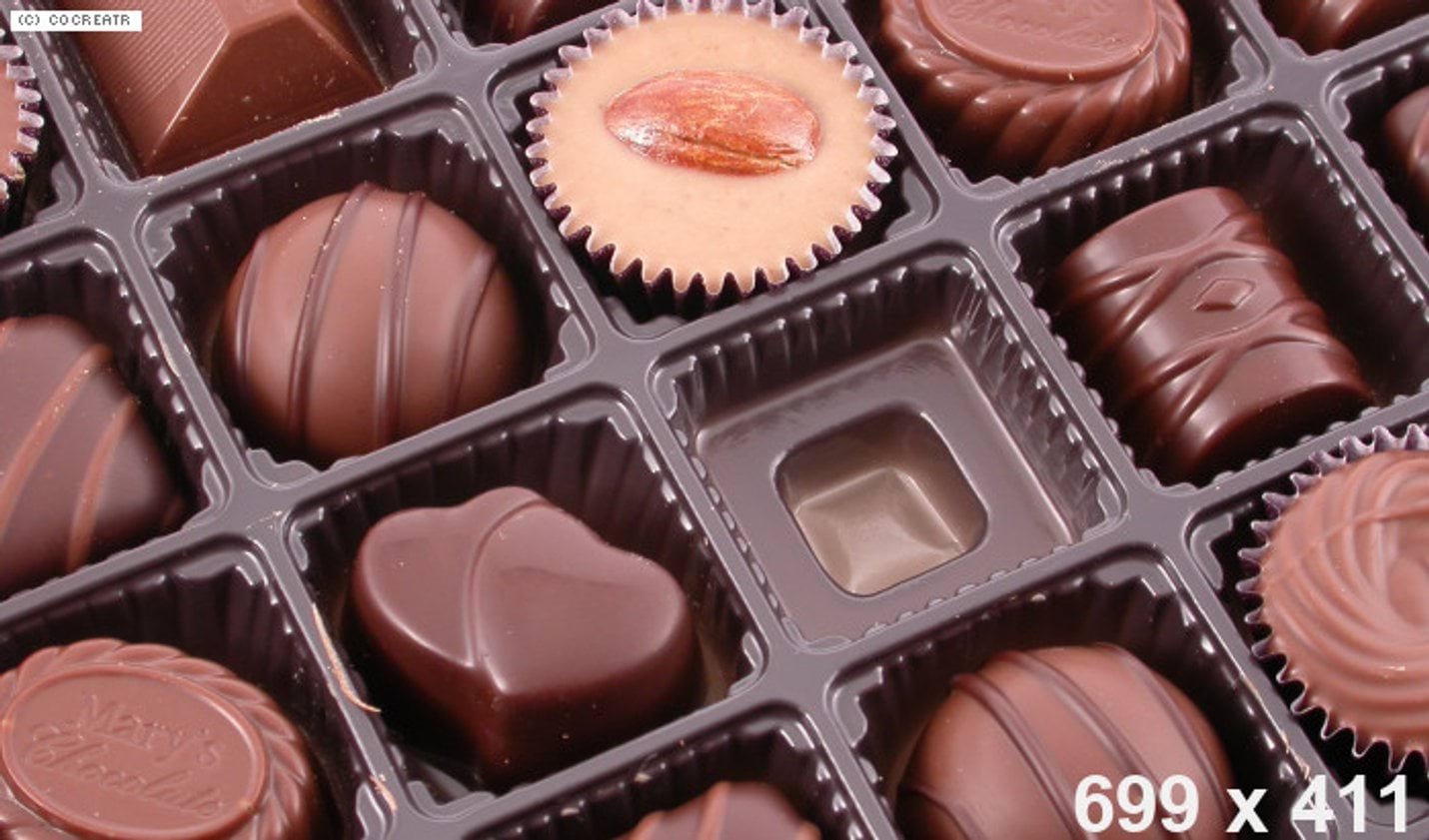
Image gallery
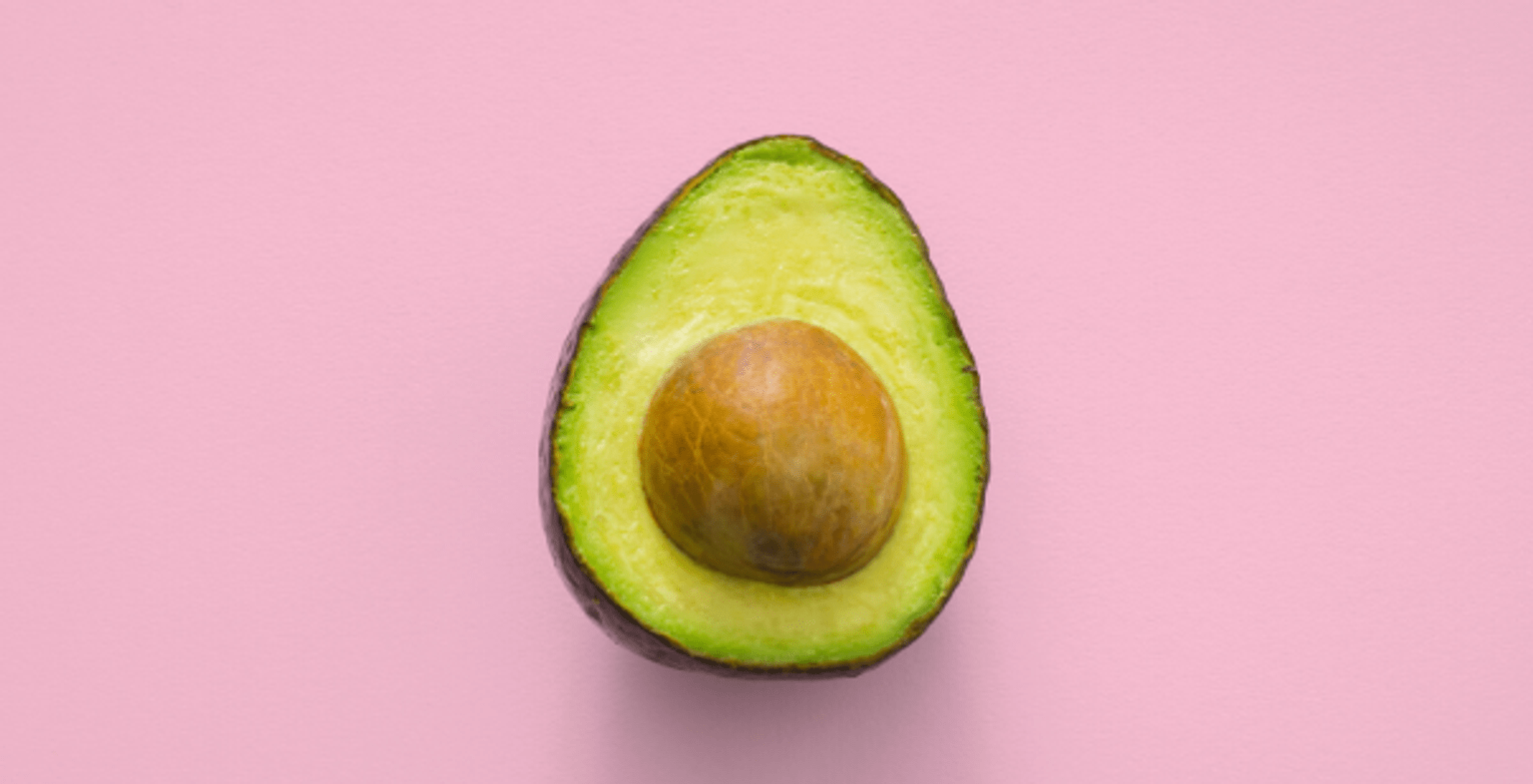
Avocado (This is the image name)
This is the image's caption
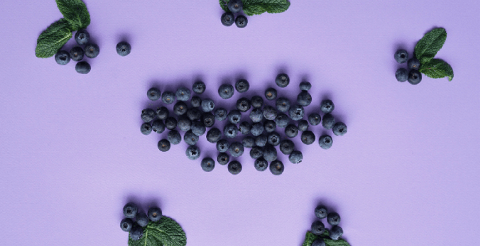
Berries
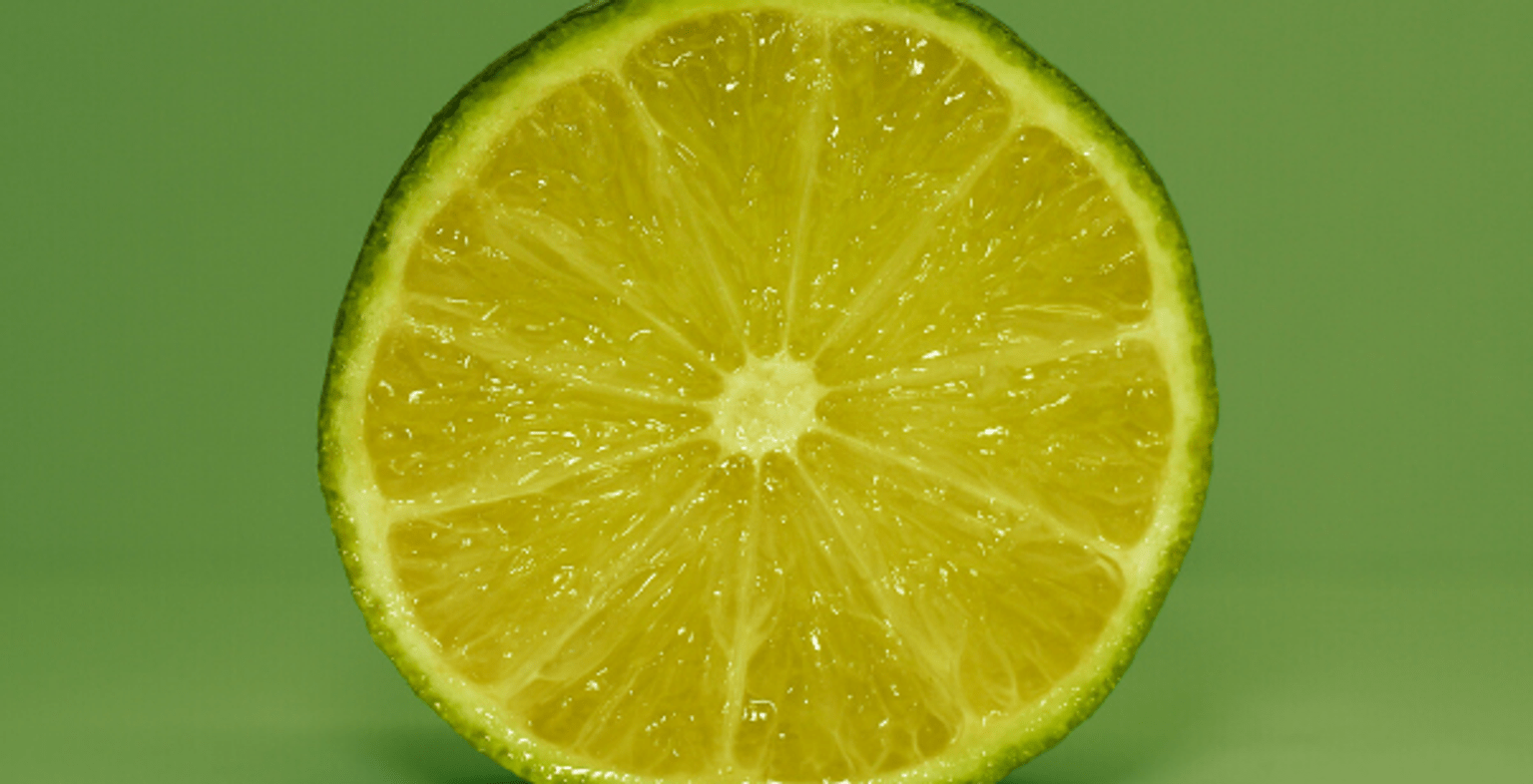
Lime
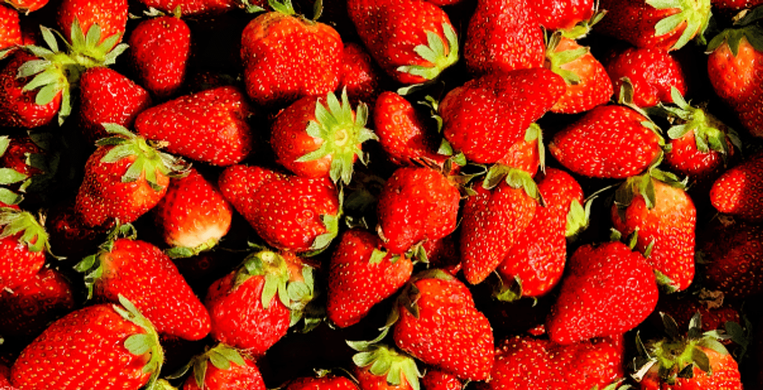
Strawberries
Complex image
Complex image title
Timelines
Timeline title (optional in component)
Entry 1 title
26 December 2021 to 28 April 2030
Summary – this is the entry description.

Entry 2 title
Text - dates can also be entered here instead of the from/to field
Summary – this is the entry description.

Entry 3 title
10,000BC to next Wednesday
Summary – this is the entry description.
- Statistic heading 1
- Statistic body 1
- Statistic heading 2
- Statistic body 2 Statistic body 2 Statistic body 2 Statistic body 2
- $3,000,000
- Don't use with under 2 or over 8 statistics
- One more longer statistic
- Descriptive label this one should fill the mobile width
- 22%
- A statistics grid can act as a summary to help users view multiple related pieces of content.
Data
Data table
| Language | Code | Right-to left? | Font |
|---|---|---|---|
Acholi | Code ach | Right-to left? N | Font X |
Albanian | Code sq | Right-to left? N | Font X |
Bosnian | Code bs | Right-to left? N | Font X |
Cook Islands Maori (Rarotongan) | Code mi | Right-to left? N | Font X |
Croatian | Code hr | Right-to left? N | Font X |
Basic text
This is a basic text component. You use this to add and format body content.
Here's an internal link.(opens in a new window)
Here's an external link.(opens in a new window)
Headings styles - this is heading 2
This is a heading 3
Heading 4
Heading 5
Quote styles
Block quote
Block quotes can add visual interest to a news article or a case study, but don't overdo them.
This is the block quote with 2 lines of caption. To add this type of block quote, insert the cursor on a new line (paragraph) and click the 'page' icon. Insert a block quote and then copy and paste to replace the default text with your text. You'll need to copy and paste the source line separately because that has different styling applied in the CSS. Following is the default text that comes up when you insert a block quote with 2 lines of caption. The 2 lines is created using a line break (Shift + Enter).
Callout styles
Single-paragraph callout
This paragraph has the Callout style applied to it (via Callout dropdown). Use it to highlight short pieces of text. It doesn't allow line breaks, headings or lists and it can be difficult to read large passages in this style. It only displays well for a single paragraph.
WYSIWYG callout
How to apply
To apply this callout:
- Format your content as you want with paragraph breaks, headings, lists etc.
- Select the whole block of text that you want to apply the callout style to.
- Click the capital C icon on your toolbar (just next to the table icon).
List formatting and nesting
Numbered list
- Select your text and click on the numbered list icon.
- When you have a numbered list, you can click the indent icon to push selected list items to the next level down.
- Second level numbered list (should be lower case alpha)
- donec egestas ultricies
- neque in elementum (should be lower case roman)
- Fusce blandit
- magna magna (should be ???)
- ut luctus nisl
Bulleted list
- ultricies vitae (style: black/grey dot)
- Quisque ut tortor laoreet
- luctus tellus at (style: circle)
- pretium dolor (style: square)
- Maecenas efficitur
- mi at ipsum egestas (style: square)
- ullamcorper.
- Maecenas
- a lacus nisi.
- mi at ipsum egestas (style: square)
- Morbi dictum feugiat
- odio, nec volutpat
- diam tristique
- vel. Suspendisse dui dui, cursus eleifend ipsum id, pelle
- ntesque dictum sapien
- luctus tellus at (style: circle)
- Fusce eleifend rhoncus orci vitae convallis. Maecenas eleifend ut nunc non commodo. Cras sapien augue, dignissim eu viverra at, placerat eget libero. In at nunc lectus. Curabitur felis libero, lacinia in augue sit amet, gravida congue urna. Nullam id maximus dolor.
Horizontal line
Buttons
Embedded media
Image
The following is an example of an image embedded with a caption.

Embedded videos
Vimeo
The following is an example of a Vimeo video embedded with a transcript.
YouTube
The following is an example of a YouTube video embedded with a transcript.
Documents for download
(The first 2 have 'Display last update date' checkbox ticked.)
Basic tables
| Column 1 (as header) | column 2 | column 3 | column 4 |
|---|---|---|---|
| Next heading | x | y | z |
| Next heading 2 | x | y | z |
| Next heading 3 | x | y | z |
| Next heading 4 | x | y | z |
Drupal forms
Drupal form title
Sample multi-step form
Updated
